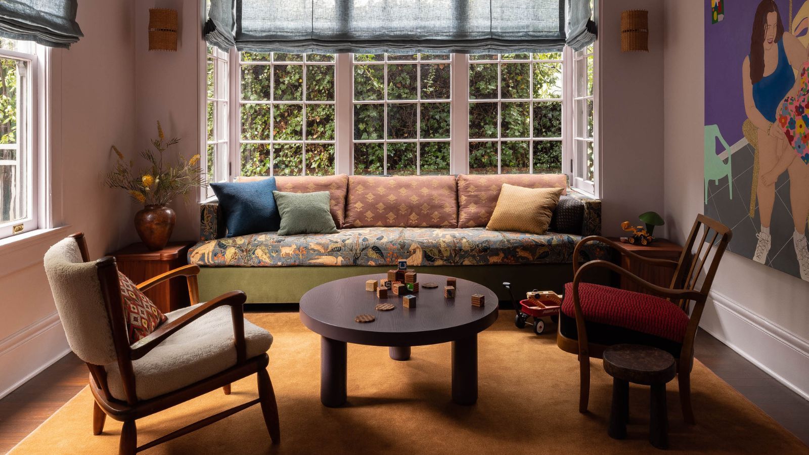
For as long as most of us can remember, interior design has been locked in a quiet, understated trance of soft beiges, cool grays, and safe creams. We treated our homes like blank canvases, terrified that adding a splash of actual personality or unexpected warmth might ruin the pristine, hotel-like aesthetic we were conditioned to chase. Personally, I think we have collectively exhausted the beige era. What makes this particularly fascinating is how quickly design psychology is shifting toward spaces that don't just look clean, but actually feel emotionally grounding. If you take a step back and think about it, our living rooms are supposed to be sanctuaries, not sterile minimalist galleries, and the color world is finally starting to reflect that hunger for depth.
Moving Beyond the Neutral Safety Net
One thing that immediately stands out when looking at contemporary color trends is the quiet rebellion happening against flat, lifeless palettes. In my opinion, the obsession with monochromatic cream and gray was always a defensive choice—a way to avoid making a mistake rather than an active expression of style. But today, designers are turning toward rich, earthy tones that do the heavy lifting of traditional neutrals while offering an entirely different dimension of comfort.
What many people don't realize is that true warmth isn't about blinding brightness or neon saturation; it is about weight, earthiness, and subtle complexity. Ochre fits this description effortlessly. It isn't the loud, primary yellow of a child's playroom; rather, it is a muted, golden, amber-adjacent shade that carries the golden hour of late autumn wherever it goes. This raises a deeper question: why have we been so afraid of golden undertones for so long? Perhaps because true warmth requires a certain vulnerability in design—it demands that a room have a pulse rather than just a polite, polished veneer.
Rethinking Where Color Lives
From my perspective, some of the most exciting design choices happen when color is applied in places we least expect it. A detail that I find especially interesting is the modern shift toward treating the ceiling as a primary canvas rather than an afterthought left blank in white. When you introduce a saturated golden ochre to an overhead surface, something magical happens to the architecture of the room. It stops feeling like a cavernous box and transforms into an intimate, cocoon-like space that physically embraces you the moment you walk through the door.
What this really suggests is that modern decorating is becoming far more experimental without losing its sophistication. You don't have to overhaul an entire room with radical architectural remodels to change its emotional temperature. Sometimes, all it takes is a clever stroke of paint on an overlooked surface, or anchoring a cool, moody room with a large-scale ochre rug that bridges the tension between icy blues and earthy warmth. It is a masterclass in balance—proving that contrasting tones don't have to fight each other; they can elevate one another into something entirely harmonious.
The Psychology of Lived-In Comfort
If you look at the homes that truly capture our attention on a visceral level, they almost always share one common trait: they feel like they have evolved organically over time rather than being unboxed from a single catalog in a single afternoon. When we layer rich ochre drapes, textured upholstery, and antique wood finishes together, we are rejecting the rigid symmetry that often makes formal rooms feel cold and unapproachable.
Personally, I find this imperfection to be the secret sauce of great interior design. A home should embrace a little bit of irregularity because life itself is irregular, messy, and layered. By welcoming golden, sun-baked hues into our living spaces, we aren't just following a seasonal trend; we are cultivating an atmosphere of enduring welcome. As we look ahead at how our living spaces continue to adapt to our need for comfort and sanctuary, embracing these richer, soulful alternatives to beige might just be the best design choice we can make.